Flex loan
Usability Test Lab
CLIENT
Flex loanROLE
Usability testing / PrototaypingTEAM
Shira Natovich (Product Design Team Lead), Dori Ginzborg (Product Manager).AGENCY
Tingz by CodeoasisYEAR
2017SOFTWARE
Justinmind, LookbackOverview
One of the leading credit card company in Israel recently came out with a loan system that helps small- and medium-sized companies offer their clients the opportunity to get a loan upon purchase. They weren't pleased with their product, and they asked us to check it out.
Objective
Run a usability test to understand the
effectiveness of the process of taking a loan with this new loan system.

Target Users
We invited 10 salesmen from a variety of sales areas like cars, furniture, dentists, etc., and 10 potential customers to test the loan system. 80% of the participants were 30 to 40 years old.
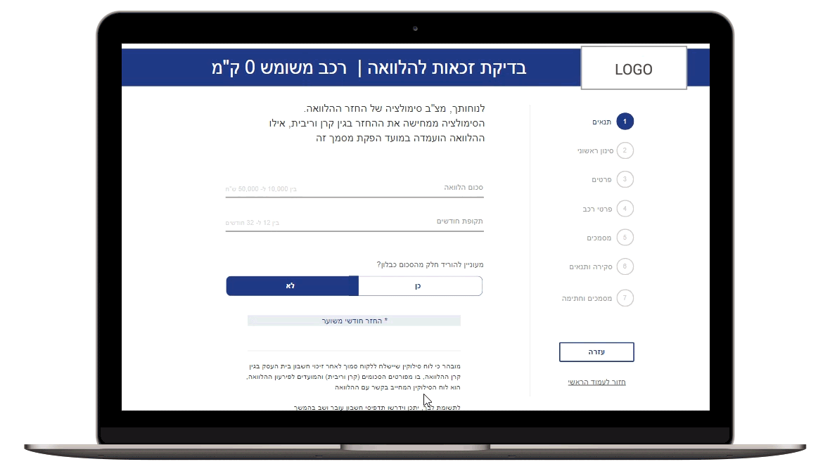
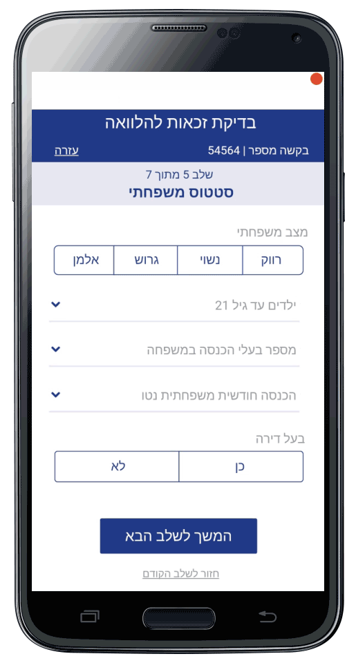
The Task
Before we started the interviews and the testing, I created a live prototype using the Justinmind prototyping tool for web and mobile apps. The participants received only one task. The customer was asked to take a loan of 30,000 NIS from the salesman. Also, he was asked to feel free to choose how he would like to fill out the personal information section, with the help of the salesman or by himself with an adjusted mobile website, if he preferred to keep his privacy.
Findings
We transcribed and recorded all the testing, then we marked its key points.
1. During the tests we noticed a significant difference between the various salesmen. Car salesmen are very eager to clinch a deal and will do everything to preserve the customer, without leaving the branch.
"I keep the customers close to me, so they will not talk to anyone.”
“My clients travel with a driver of the dealership's car to get current accounts from their bank, so they do not get in the way.”
The other salesmen, who didn't sell cars, assumed that taking a loan is a process that needs to be considered and it's not an impulse purchase.
"A client will never come to do dental implants and take a loan on the spot ... he comes, gets an offer, goes home thinking about it and comes back to close a deal."
2. The number of questions asked is too high.
"You should already know this information about me; my credit card is linked to my bank."
All users complained that the process was too long. Some salesmen were afraid they would lose customers because of the cumbersome nature of the process.

3. Some of the questions are too intrusive
"It's very intrusive, people agree to answer all these questions? ... "
Some users were afraid to reveal personal information to a salesman whom they did not know.
4. There are too many screens in the process.
"It's just exhausting to switch from screen to screen all the time."
"It's very intrusive, people agree to answer all these questions? ... "
Some users were afraid to reveal personal information to a salesman whom they did not know.
4. There are too many screens in the process.
"It's just exhausting to switch from screen to screen all the time."

Design Suggestion
According to the above, we recommend:
1. Because of the difference between the two kinds of sales and salesmen, we recommended separating the loan system into two different applications, one for the car sales and the other for the rest.
2. Redesign the UI and make it more intuitive to use while maintaining the brand values.
3. Rephrasing questions that may sound too intrusive.
4. Removing questions that are irrelevant for the process of taking a loan.
5. Combine multiple screens for an easy, continuous experience.
 Yotpo, Email & SMS multi-message
 App UX/UI. Prototyping. Usability Testing