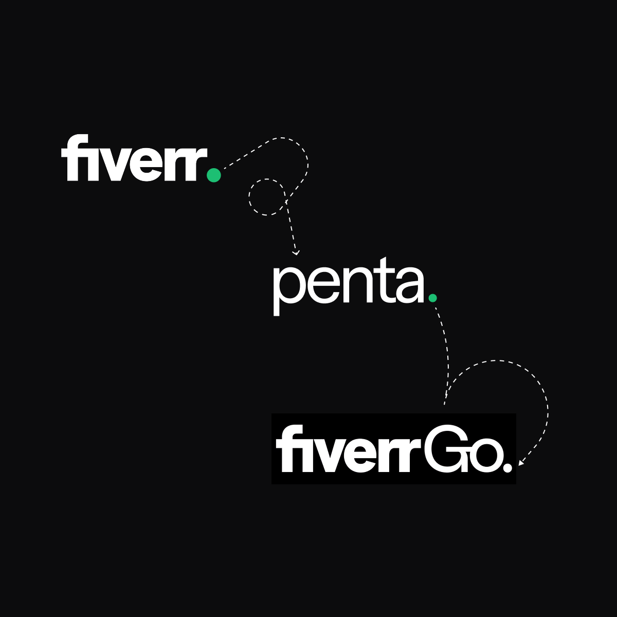
My Role
As the Lead Designer, Fiverr Design System, my primary responsibility was to define the Dark Mode implementation, a solution that would serve Fiverr Go immediately and lay the groundwork for a site-wide dark mode in the future.
Foundational Pre-Work: Semantic Tokens
Even before the Fiverr Go project started, the Penta Design System lacked semantic tokens. My initial key project at Fiverr was to address this by defining a robust set of semantic tokens based on our existing styles.
This foundation provided guidance for product designers. Colors, sizes, spacing, and typography were clearly defined, eliminating guesswork.
The Benefit of Semantic Tokens
The decision to architect a system based on semantic tokens was driven by a fundamental need to bridge the gap between abstract technical values and functional design intent.
Rather than forcing designers and developers to reference raw values like ׳color-gray-300׳ , semantic tokens, such as ׳color-border-default׳ or ׳color-surface-primary׳, provide the style properties with meaning and purpose. This provides immediate clarity on why a specific style is being used, significantly boosting product consistency and speeding up decision-making.
Also, semantic tokens are the most efficient foundation for future evolution. By creating a single layer of abstraction, they enable a system to manage complex variations like different themes, sizes, or densities, making them indispensable for building robust future features like Dark Mode.
Semantic Tokens Architecture
The architecture of semantic tokens was designed, based on a multi layered hierarchical model. This strategy aimed to create an intuitive language that expresses intent with meaningful labels, instead of relying on technical values.
The tokens were categorized into main three core functional layers: background, surface, and foreground.
This model offers two main benefits: it creates a clear visual and operational hierarchy, while simultaneously establishing consistent design rules (governance). This framework maintains a fluid system that supports designer freedom.
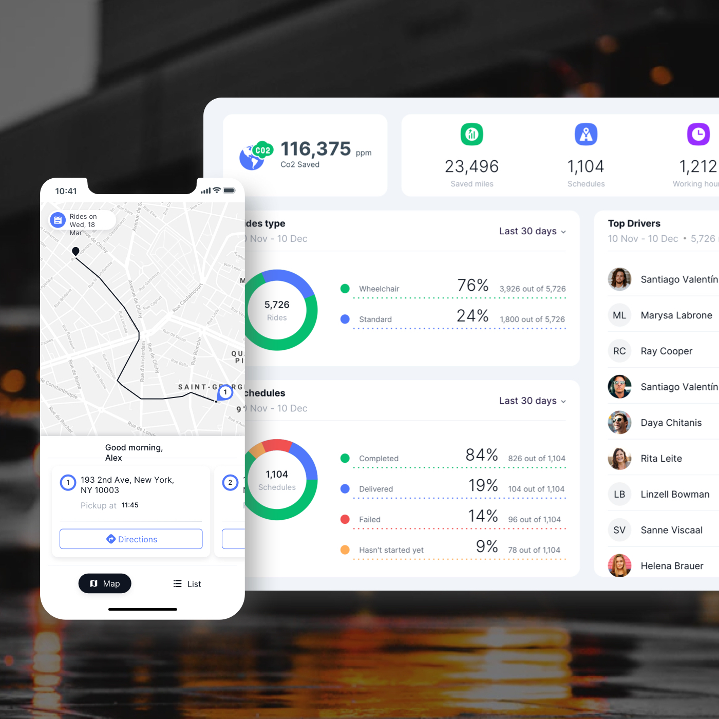
Utilizing these semantic names ensured maximum consistency and allowed teams to instantly understand the color's function. Furthermore, this model significantly simplified adherence to accessibility standards by guaranteeing correct contrast ratios between layers, and it was the core enabler for the rapid and effective one-click transition to Dark Mode.
 Yotpo, Email & SMS multi-message
 App UX/UI. Prototyping. Usability Testing