Building a design system
Mapping the state of current products
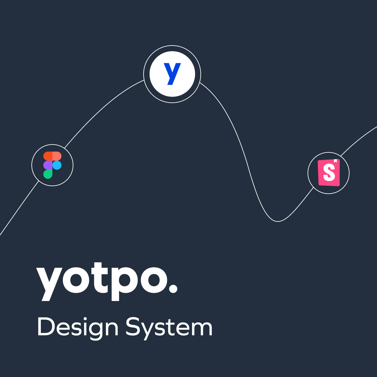
Before embarking on our design system initiative, Yotpo already had a foundational design visual style focused on set of guidelines defining the appearance of our products, including color palettes, typography, and iconography. This old system, released as a Sketch library, primarily served a small team of 3 designers and 70 developers.
To create a scalable design system, my first step was to map the existing design state by collecting and analyzing all the different styles used across our products, including:
Layout: Examining grid systems, spacing, and responsive behaviors.
Typography: Font styles, sizes, and line heights.
Colors: Documenting color palettes and their applications, including contrasts and accessibility considerations.
UX Patterns: Reviewing interaction patterns, such as modals, navigation, and forms, to identify gaps and redundancies.
Identify the basic and immediate needs: Based on future and current projects
This comprehensive research not only highlighted inconsistencies but also provided a clear picture of what needed to be unified.

 Yotpo, Email & SMS multi-message
 App UX/UI. Prototyping. Usability Testing